Sushi Desu! is a japanese sushi restaurant located in the metropolitan area. Their goal is to provide high quality sushi dishes that caters to all types of palates. They have a wide variety of dishes, all which should be easily accessed and ordered though the new ordering app that we are building.
The Problem
Sushi Desu! wants to update their menu to a digital version, but they also want it to address an issue they've noticed. When there is a big group at a single table, the time taken to place their orders grows proportionally to the number of people at the table. This lowers the efficiency of the kitchen and discourages groups from dining in the restaurant as well.
The Goal
To design an app and system for Sushi Desu! That allows customers to easily order their own individual meals to their table quickly and easily to improve efficiency.
My Role and Responsibilities
UX Research, UX Design, UI Design, Brand Identity, Prototyping, Testing
Initial research focused on analyzing customer reviews, complaints and frequently asked questions; after which user interviews helped further distill the information into user needs and pain points.
In-depth interviews were conducted with 5 participants that fit in the target demographics, resulting in a few interesting insights.
"Splitting bills with friends is a pain
"I don't like waiting in general, but it's worse at restaurants when I have to wait to order and then wait for the order
"I don't know if a dish is safe to eat or not
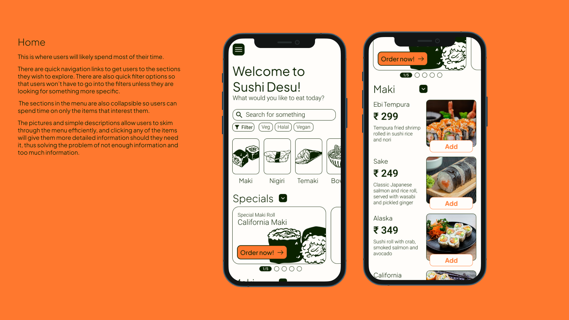
01: Most people want to know the ingredients in their dish
02: Text alone doesn't inform users enough to make a decision
03: Many people are frustrated when they have to wait to order
04: Many people wish to customize their orders
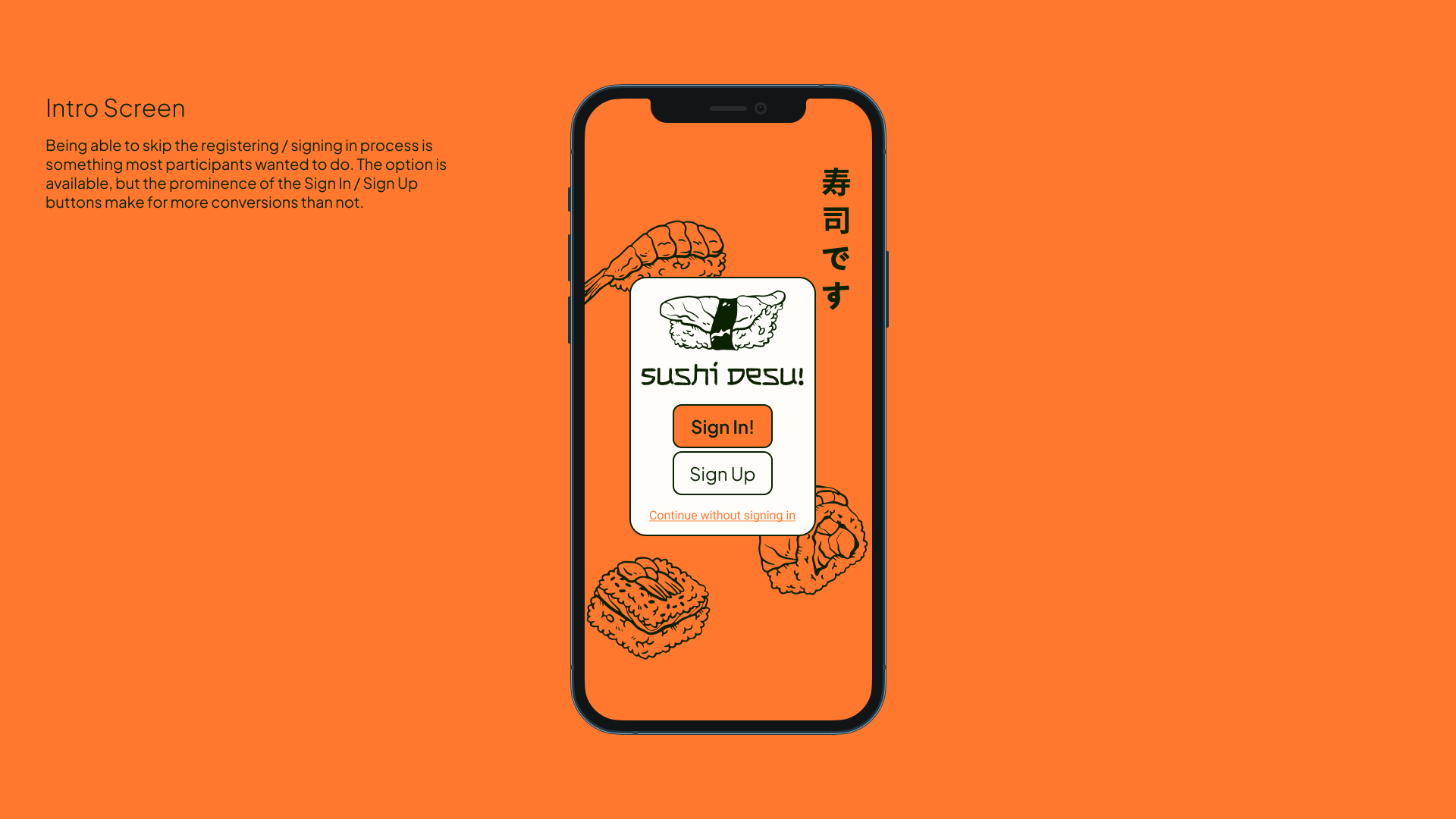
05: Most people do not want to sign up / register when using an online service / app to order food
06: Having too many options all at once can overwhelm users and often results in a dropped sale
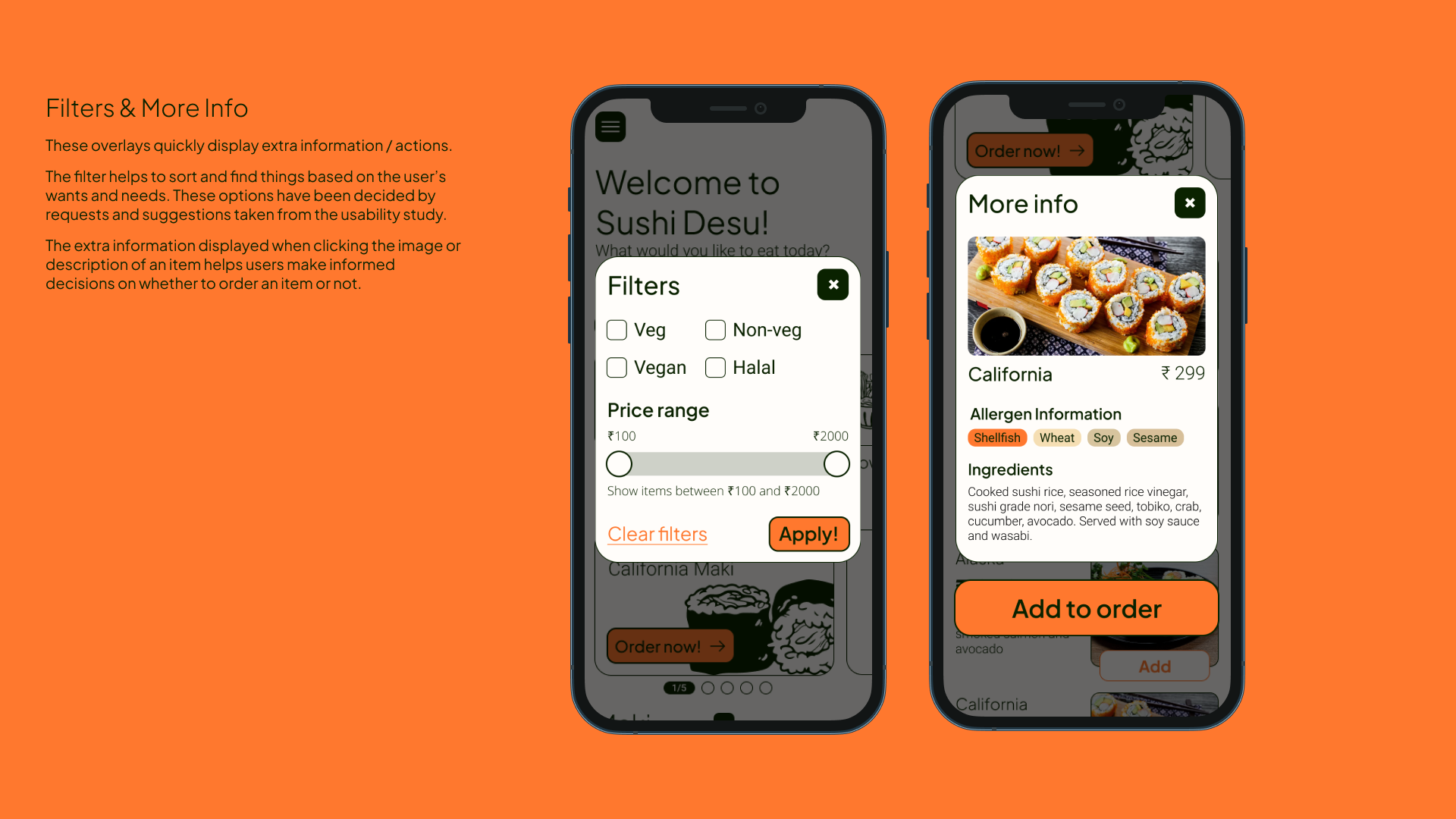
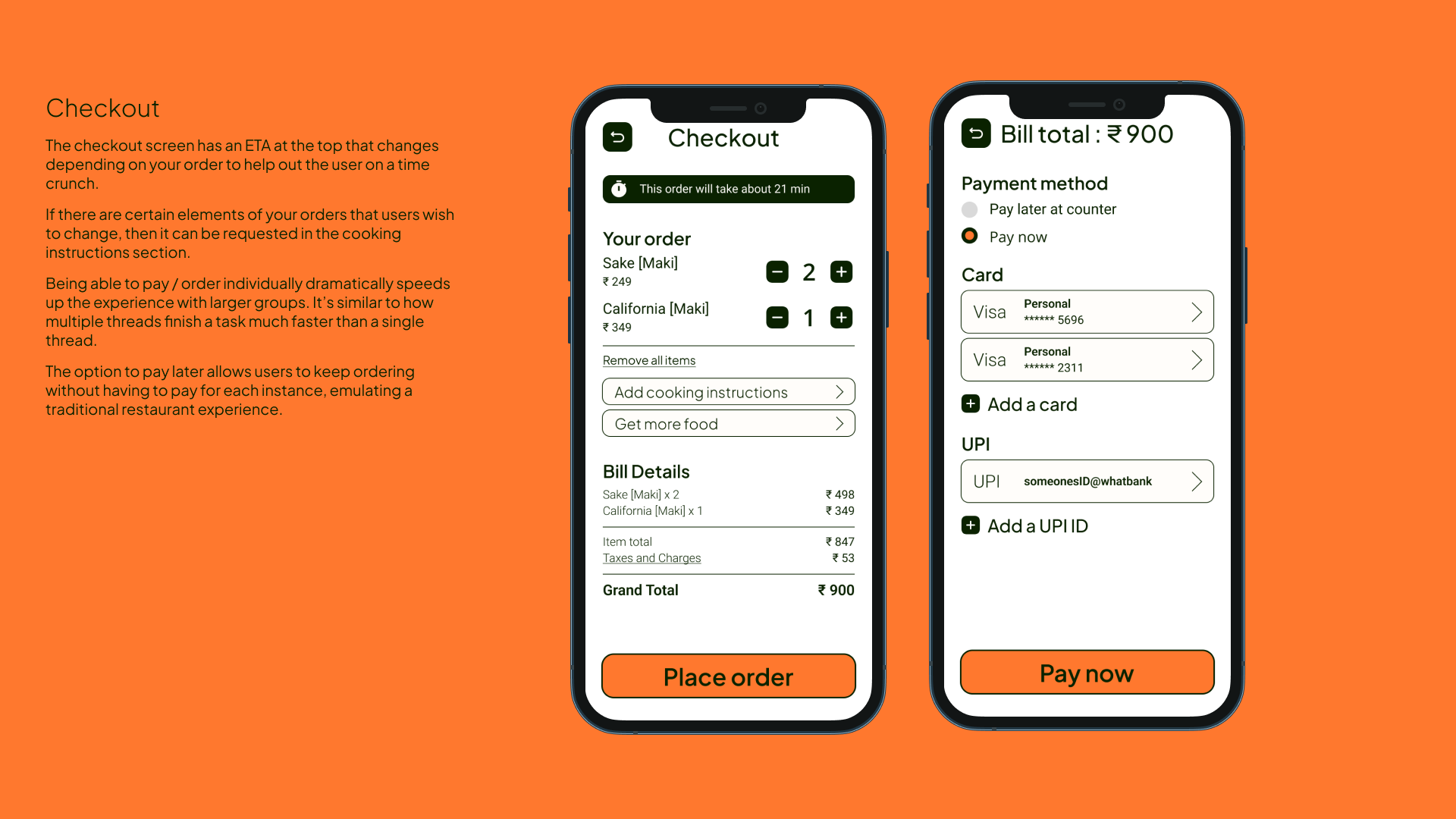
Our menu app will let users filter, search and order through a dynamic menu by table number which will affect busy users and larger groups by simplifying the ordering process and increasing efficiency when ordering as a group. We will measure effectiveness by number of orders placed through the menu app.
Using the data collected and the insights formed, the fun part of the design process can begin.
The rough sketches on paper got all my thoughts into a tangible form very quickly with minimal investment.
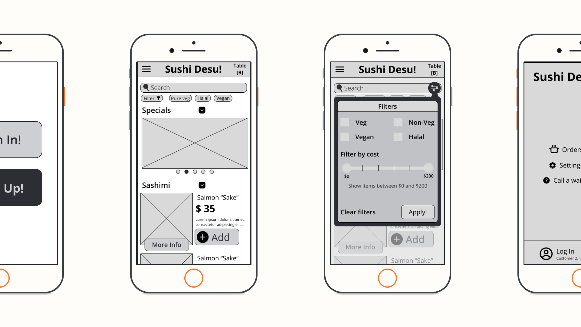
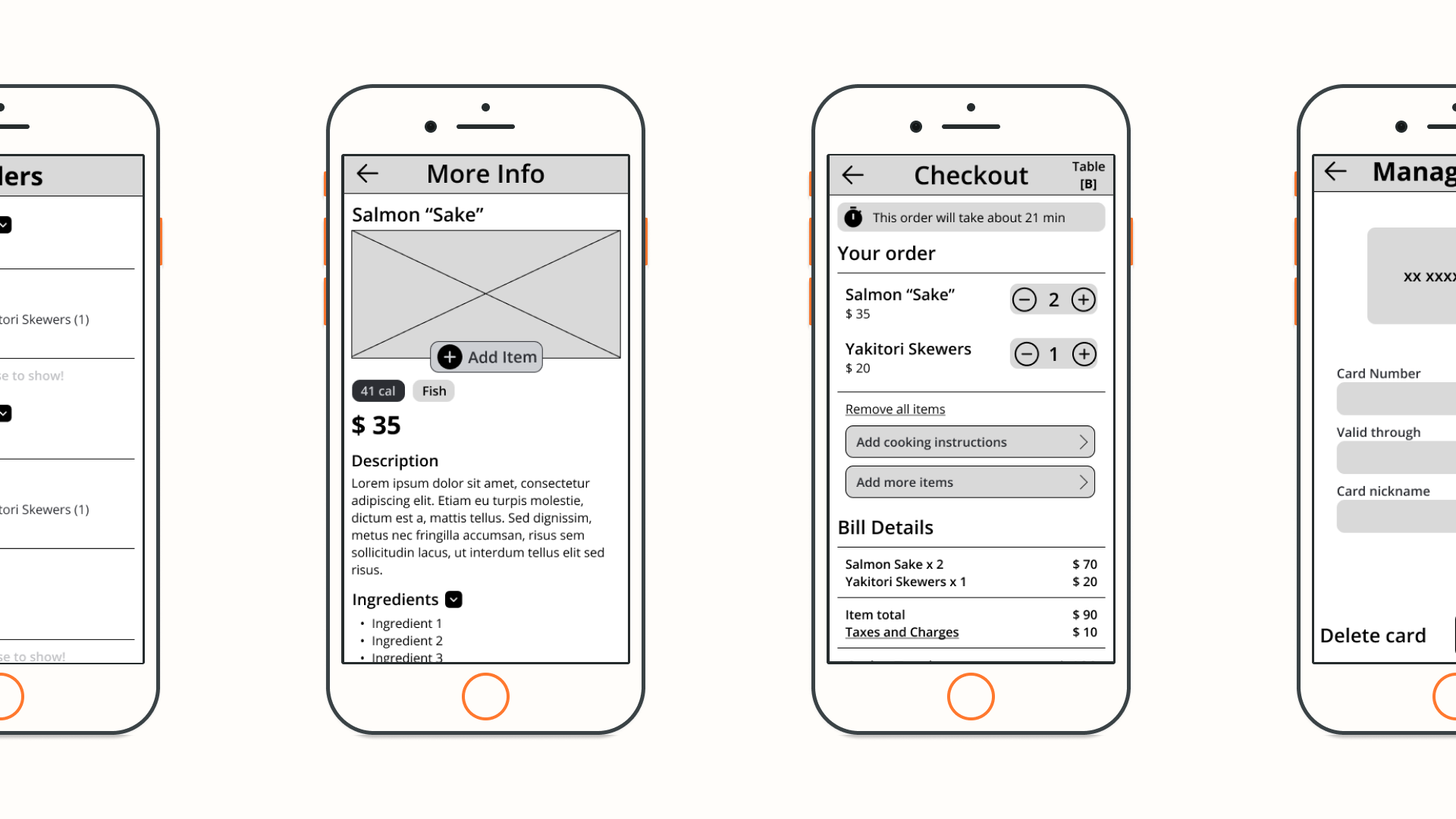
Now with a better idea of what UI elements to use and what kind of screens I need on the app, a low-fidelity wireframe was created to start on user testing as soon as possible.
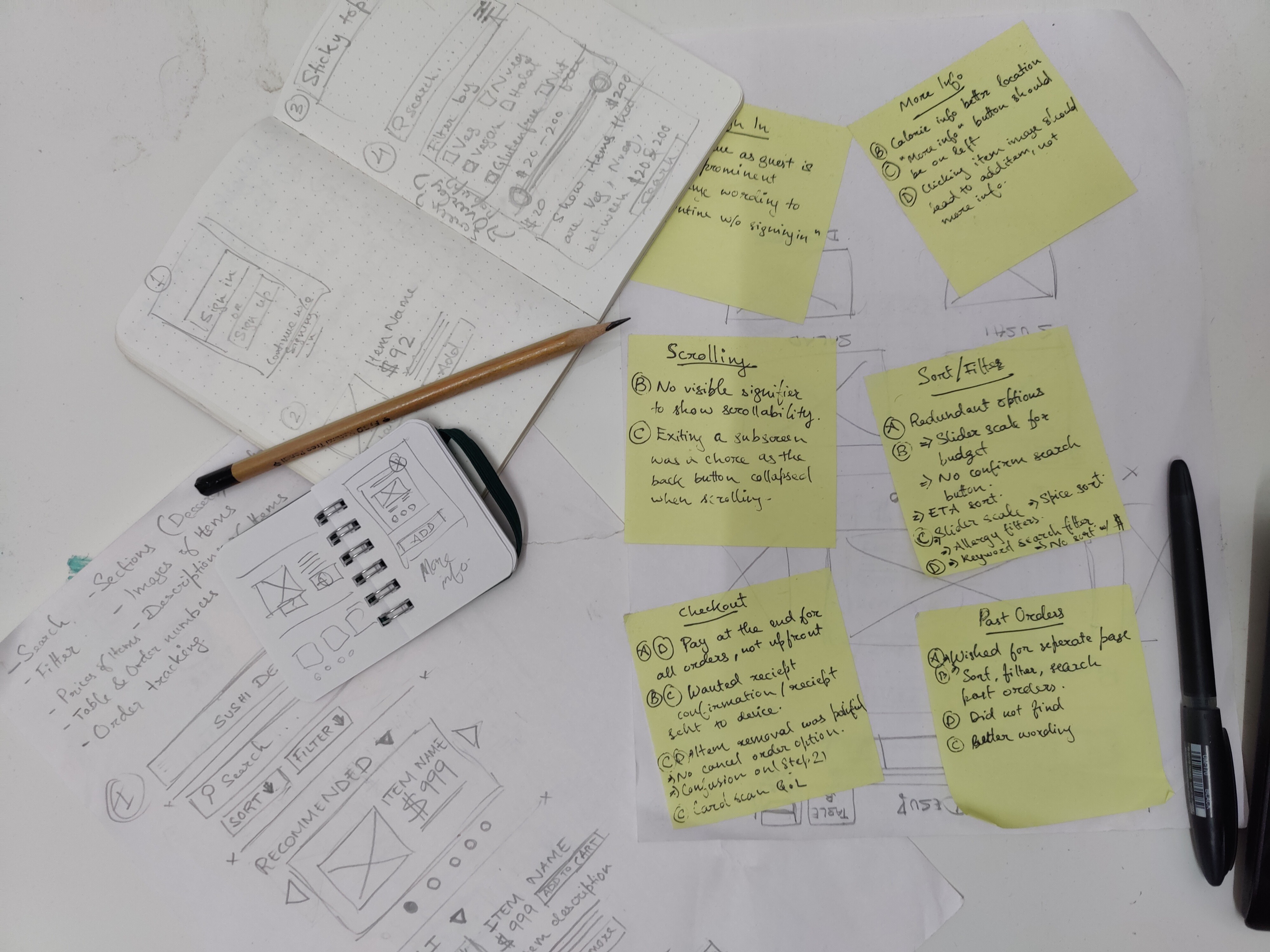
To determine where improvements could be made, to identify new ideas, to see what worked with users and what did not, a usability study was conducted
"I didn't want to sign in, so being able to continue as Guest was nice
"At a more upscale place like these prices imply, asking for payment up front is almost an insult to the customer.
"I'd prefer the price range to be represented better, visually. A sliding scale would be perfect here.
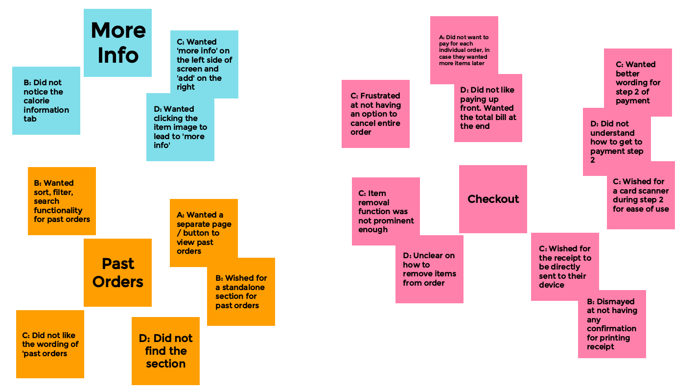
To quickly differentiate and group the different insights gained from the interviews, I put together a quick affinity map

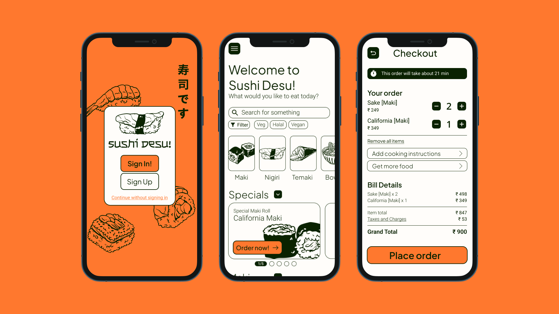
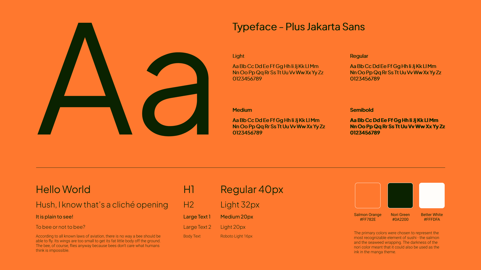
I took a lot of inspiration from the black-and-white art of Japanese manga, focusing on its simplicity and clean design.
The new menu is meant to increase conversions and get people to order more food. It's easy to browse, helps make informed decisions and place orders intuitively.
In closing, the design of this menu presented unique challenges and opportunities. Through thorough research, user-centered design, and iterative testing, this case study demonstrates the importance of understanding customer needs, creating an intuitive and visually appealing interface, and streamlining the ordering process.